
Photoshop Tutorial: Create a Professional Music Album Template
Hi everyone. Today I’m going to show a tutorial about how to make a template for an album for a music CD. This is not your usual ‘how to manipulate or draw’ type of tutorial.
Rather the main focus is on text and layouts. Although a little retouching is needed.
After reading this tutorial it might help you get ideas to make a personal album for yourself. Also if you want to follow through this tutorial as exactly as it is, be sure to download the source and the fonts. Also be sure to ask permission if you are going to use the headphone girl stock.
Links:
Headphone girl source
Girl with guitar source
Mockingbird guitar source
Compact Disc source
Armor Piercing Font
Borneo Font
Stoney Billy Font
Step 1
Okay, we are starting with a blank document here. The document size is 2929*1494 px. Well this is not the actual size for a CD cover but it has the exact proportion.
I choose this size so I have more freedom in editing and also I feel more comfortable in editing big size images. Make sure dpi is set to 300 dpi or higher if you intend to print it.
Make sure snap to guides is enabled. From menu View>Snap To>Guides. Also enable the ruler. Hit ctrl + R( command for mac).
Now I set up the guides. Setting them up is kinda easy if you know how.
For making horizontal guide, click on the horizontal ruler( it doesn’t matter what tool you have at this point). Holding the mouse button drag and release on the spot where you want the guide to appear.
For vertical guides use the vertical ruler. If you messed setting up the guide go to View>Clear Guides or using the move tool click on the guide and drag it back to the ruler.
As you can see in the ss, I divided the document into many part and I also marked in the ss which guide is the middle point. Also guide automatically snap to middle point both horizontally and vertically( provided snap is on).
Don’t neglect the guide layout part. Cause guide is really important in desk top publishing. Plan carefully the different section of the album.
Hint: Through out the tutorial ss refer to screen shot. Also ctrl key in windows is equivalent to command key in mac. Similarly alt key is option key in mac.

Step 2
Also before actually putting images and text into it, let talk more about layouts. Also please remember I may not be an expert in all these. But I am familiar to some of the concept.
So we can make a pretty decent album cover for your personal collection. Now more about the layout process.
The first layout I wanted to make like a double front cover which is fold able and both side can be used as as the cover. As you can see in ss where I wanted the elements.
Generally it is more practical to have the band on the top left of the cover but I placed it on the right side. So that people first see the model and then see the band name.
Also text over images don’t really go well. However you can get away it if you place it at the edge with some drop shadow or strikeout. Also never put text over faces.
Another thing you don’t have to put the elements as exactly as the guides, you can have some improvisation. Although be careful with text.
Well now you must thinking, when the hell is he ever going to start adding graphics and text. Soon my young jedi.

Step 3
Okay the theme was to create a cover album for a rock band. Well what exactly is rock, is it a genre, is it a rocking song regardless of the genre or is it a song that rocks the socks out of you.
Well if we start a discussion on it it will never end. I don’t believe in the genre stuff. I just love the song regardless of the genre.
I love Enrique “She be the one” to Cradle Of Fifth “Nympathine Girl” to Rolling Stones “Anybody seen my Baby” to Cannibal Corpse “Lycanthrophy” to Christina Augilera “Genie in a bottle” to David Bowie “Space Oddity” to Taylor Swift “Love Story” to Shaggy “Hope” to Sum41 “Fat Lip” to Dire Straits “Industrial Disease” to Royksopp “Eple”. Well this list is long, so I will end here.
My point is rock as genre is really rare now a days esp. pure rock. My album was said to be pop looking. Well I never intend it to look old rock or hard rock. It was suppose to be modern, contemporary and a little bit of pop. Well I may be egoistic, but I am not an opinionated person, I respect other people opinion as long as they respect mine as well.
Well now leaving the thing I said about me, lets move on. Now since I wanted the album to have a contemporary look I had to choose pic that suit this. By accident I found the headphone stock and I knew it that this is what I needed.
Also since I imagined the band’s music to be soft and blissful. I had to choose cool color scheme like blue, green etc.
It had 12 pic and I couldn’t use all of them. So I picked 4 of them.
One had the profile view, another one was also a profile view with her hand touching the headphone. The third had a front view and the last one had that lean back posture.
Pic 1 and 3 were chosen for the front cover. Both pose were suitable for the the front cover. Pic 2 was chosen was the inlet and pic 4 for the back cover.

Step 4
Now using the help of guide re sized and placed the picture 1 inside the document. With the pen tool masked the model. Used smudge to adjust her hair.
A tip, while using pen tool to mask a person or complex shape that are not primitive in nature( i.e. circle, square etc) make sure the guide are hidden( well that’s personal preference) so that they don’t interfere or turn off snap.
Short cut to hide the guide is ctrl + ;
I also made sure that her body end is snapped to the middle guide.

Step 5
Now using the healing brush to heal some of her blemishes. I prefer using the heal tool instead of the clone. Clone can be harsh sometime. Best is to use combo of both.
Then I copied the pic layer and added a smart blur to it with the following setting:
Radius: 2 to 3
Threshold: 22 to 25
Quality: Low
Mode: Normal
Also one thing I forgot to mention before. Always make loads of layer for this type of work, name it properly and keep in organized folders. Will help from tearing your hair out later on.

Step 6
Now I made a mask for the new duplicated layer and hid the blur. Now choosing a soft brush( Choosing the brush size depends on you. I choose around 20 to 30 px) and with black color brush over the mask.
I brushed over the areas like the face and body. How ever I avoided the eyes, lips, neck, hair folds and dark shadowed area as not to get a over retouched looked.
I could have made her lips more reddish by brushing over it with the red color in a new layer in overlay. But I liked her already gloss lips.

Step 7
In the same way I added picture 3. Using the guide adjusted and place the image as shown in the figure.
Guides really help out in alignment of images.

Step 8
Now I picked a color from the original background of the image and filled a new layer behind the image as a backdrop.
The value of the color is #b7beac.

Step 9
Now I filled a gradient of white to transparent as shown in the ss in a new layer over the backdrop. I used the gradient to show that light is coming from the right.

Step 10
Now I made a duplicate of the gradient layer. And then I moved and snapped the gradient as shown in the ss.
In this album making, I will be reusing lots of element which I have created before. This saves time and add to the consistency of the album.

Step 11
Now I made a new document of size 3500*3500 px. Now I made two center guide( horizontally and vertically) to find out the center point of the document.
Now using the ellipse tool. Pressing shift + alt key I clicked in the center and dragged to make a circular path( I used the path option). Then I stroked the path with a black color of size 10 px.
Similar I made the other circle. So in this way I made the concentric circle. Now making sure the background is transparent I duplicated the circle and imported it in the front cover document.

Step 12
Now I placed the swirl above the backdrop and below everything. Also changed the opacity of the swirl layer to 75%.
Actually at first I thought of dividing the swirl and place it differently. But I noticed this way of placement will look way more nice and different.
Also it looks like a wave( which was what I had in mind) corresponding to the word “resonance” of the band’s name.

Step 13
Now using the font Armor Piercing 2 wrote in “Gaussian” and “Resonance” in two separate layer. I also aligned the “R” of Resonance with the “a” of Gaussian.
The color used here is white and #28a289 which I picked up from the green color of the model’s hair with the color picker tool. Also save the color as swatch, will be helpful later on.
Then I made the symbol for Gaussian Resonance using custom shape tool and pen tool. I will explain how I created it in the coming step.
I also added a stikeout layer effect of 3 pt. I choose an alternating color for the name and strikeouts.
Now keeping all these 3 element in a folder group. I don’t merge text until I need em to e.g. if I have to apply a certain filter cause later if you need to edit text unrasterized text helps a lot. Also if you do need to rasterize it, make a copy and then rasterize.

Step 14
For the symbol, I created a new document of 500*500. Size doesn’t matter, but it convenient to make a bigger size. Also make sure it is in square proportion.
And I choose Bull’s Eye shape from the custom shape drop down. When drawing custom shape/ shapes I think the default option is “Fill Pixel” I guess. But I prefer the “path” option. “Fill pixel” requires less step, but I like path option for unknown reason.

Step 15
Now make 2 mid guides as shown in ss to find out the center point of the document.
Now pressing alt and shift( the cursor changes as in the ss), hold it over exactly at the center. Holding the mouse button, drag the cursor.
What this does is, it creates a perfectly proportioned and symmetrical shape( in this case circle) starting from it’s center point.

Step 16
This is the shape which I have created. Looks nice and clean huh??? Now since it was created as a path, have to fill it with a color, preferably black in this case.

Step 17
Now filling the path with the foreground color( since here the foreground color is black) and then deleting the path.
This is what I have now.

Step 18
Now using the pen tool make a path like this. Since you have snap on, it will correctly align your point as shown in the ss( But only in the guides. Doesn’t align if there are no guides).
If it doesn’t snap, make sure your snap is on. Shortcut is shift + crtl + ;.
Well you don’t actually have to use the lasso tool here. One can even use the polygonal lasso tool as well. I have become so accustomed to the pen tool, I use it for almost everything in photoshop.

Step 19
Now make the path a selection and delete it off. And you get this.
I also forgot to mention before.Create your shape in a new layer. That way you will be easily able to edit your shape and export it with transparency easily.

Step 20
Now removing some part opposite to it. And rotating it I get the shape as shown in the ss.
Also I right click on the layer in the layers palette and choose Duplicate Layer from the layer context menu. And I choose the destination as the name of your cover document( cover1.psd in this case).
So basically this is how I created the symbol. Custom Shape tool and the pen tool is very helpful in creating your own custom shapes.

Step 21
Now duplicated the band name folder and arranged it as shown in the ss.
Also switching the font and strikeout color. See how not rasterizing the text or merging helps. 🙂

Step 22
Now using the font Borneo I wrote in “Gaussian” and “Resonance” again as show in the ss. “Gaussian” here is written with the vertical text tool.
Also adding strikeouts in alternating style.

Step 23
Now created a drop shadow for both the texts.

Step 24
Made again a copy of the album name and arranged it as shown in ss.
Switching the color of the font and strikeouts yet again.

Step 25
Now using the swirly thing I created before( in step 11). Changed the color into white and re sized it into an appropriate size.
Then placed it over the model’s headphone. My purpose was to create an sound wave like motion to show that the headphone is playing something.
Well this would have have done the trick, but it cover the model’s face and I wanted the model’s face to show.

Step 26
Now I created the shape by using mask and estimation lol. You can do it as mentioned in step 18.

Step 27
Now copying and adjusting the position of wave over the second model image.

Step 28
Now making a box like this for the parental advisory sticker. Okay surely I don’t have explain how I made this. It’s simple to make.
You can either make it using line tool, pen tool, rectangular marquee or the shape tool. Using shape tool is better and faster I think.
And I placed it as shown in the ss.

Step 29
Now I added the text. The font used is Arial. Well I haven’t really mentioned the point size, did I? Well that’s up to you.
In lay outing you just don’t have to worry about the text point size, but you should experiment with other setting in the character palette.
Some of the option I used are:
Set the leading – It controls the vertical space between the lines or text.
Set the tracking – It controls the spacing between each character.
Vertical Scaling – It controls the height of the text.
Horizontal Scaling – It controls the width of the text.
To know which icon are what, just hover your mouse over the icon and you will know what that icon do.

Step 30
Now copying the parental advisory sticker and pasting in the other side as shown in ss.
Now this finishes the tutorial. Nah, just kidding. This is just 25% done, now 75% left.

Step 31
Okay made an another document of the size 2929*1494 px. And also made guides to help arrange the text and the pics.
As you can see in the ss, how i planned the layout should be. I marked it arbitrarily at first and then worked on it.

Step 32
Now took picture no. 3, masked it and did the same retouching as I did with the model’s images before.

Step 33
Now added a black frame and added the nude girl with guitar pic( didn’t mask or anything just placed it as it is. Did resizing though lol).
Also as you can notice I didn’t place the nude girl directly in the center of the frame. Took a bit different approach lol. Also did the usual retouching to it.

Step 34
Now a added black banner style top header and a black base gutter.
Also added the Mockingbird guitar stock. I had already masked, made some color adjustment and add a reflection to it. I forgot what setting I used. Probably hue/sat, level and curve. XD

Step 35
Now I imported the band name from the previous document, removed the strikeout and made it single color.
When doing layout for albums make sure you reuse object creatively. It minimize your workload and help in maintaining the consistency of the whole album.

Step 36
Now I added some green and white dots as shown in the figure using a 100% hard brush. Through trail and error got the following style.

Step 37
Now using the font Borneo I added the text “Blurring the blur in music” just for kicks. Added strike out and made color variation between the texts.
Also Borneo font don’t have brackets 🙁 So I had to use the bracket from Arial font.
On a side note, the line “Blurring the blur in music” isn’t suppose to mean “make a blur in music” but to remove the blur that is present in music.
Something like that, think of it as two negative makes a positive. Well that’s just my thought. >.>

Step 38
Now I thought what was missing and I noticed… No swirly wave lol.
So copying the swirl from the previous document, pasting it over the backdrop layer and changing it’s opacity to 75%.

Step 39
Now I added a drop shadow to the model as to show the illusion that the model is front of a wall.
I don’t use layer drop shadow, rather I draw them manually using 20% opacity soft black brush.
Or selecting the cut out of the image, filling it behind the image with black color, Gaussian blurring it( amount set to according to the distance the shadow is suppose to be) and setting the opacity to less than 60%( depends).
In this case I used the linear gradient fill of black to transparent.

Step 40
Now I added the song list to the right and left side of the model face using Arial font.
The text color is green as taken from the model’s hair( I save the swatch before, remember.)
Also following the scheme of the album, gave a strikeout. But giving it 2 pt this time.

Step 41
Okay now I used the space inside the frame of the nude girl as a scribble board( I later gave up the idea of scribbling myself with the pen tool). So to say a page where the band say thanks.
Also the text written at the left side of the girl was aligned as default where as the text written at the right side of the girl were aligned from right.
Also I made the text format as show in red line in ss. Following the counter of her body. As text on image( in this case the girl’s body) doesn’t look good. I think I have mentioned that before.
A few text does get on her body, but it doesn’t look that bad. xD

Step 42
Now I added stuff like copyright info, warning and other stuff at the bottom gutter.
Need help on writing these, take a music cd and have a glance. That’s what I did. xD

Step 43
Okay now added the “Rockwell Studio” and “Avacado Music” logo.
Rockwell was written using Stoney Billy font and studio was written with times roman. Adjusted the texts with tracking.
Made the Avacado logo by first making a rounded rectangle, the making that symbol from custom shape tool( this shape is a preset in the list).
And the text is written with Times Roman font.

Step 44
So now the inlet cover is done. 50% complete and we are at step 44 lol.

Step 45
Now making an another document of the size 1898*1494 px and filling the background with the color #b7beac. And as usual drew guides.
As you can see in the ss. How I planned the layout. However it was not so systemic as shown in the ss lol. 😉
More like it was in my mind. I just labeled it nicely for you to get a clear idea of what I thought. xD

Step 46
Now I masked the model from the picture 4, straighten her out and retouched her.

Step 47
Here I added the swirl yet again and made shadow behind the wall.
I do admit the wall behind her( faked obviously) is looking kinda weird( but not bad). I could have made it look like it was a corner by distorting the swirl and added some shade near the distortion.
But I liked the weirdness of it and kept it. xD

Step 48
Okay now I made a black bar whose dimension is same as that of the guide space as marked in the ss.

Step 49
Now I added stuff as marked in the ss. I added some random number for the serial number.
I reused the band name from earlier document. Also reused the “Rockwell Studio” logo.
Re sized and arranged them as shown in the ss. Also kept all the elements inside a same folder, so later on will be easy to duplicate and rearrange.

Step 50
I got rid of the black bar( simple as hiding the black bar layer)… And made copies of it and arranged as shown in the ss.
Also notice that direction of the bar. One starts from the top and the other bottom. Some cd back cover have two side bars like these, some don’t.

Step 51
Now added the name of the band, this time with full white and a black backdrop.
Also added the song list. Font used is Arial and with a 2 px size strikeout.

Step 52
Now I just copied the copyright info, stuffs and logo which I had created in step 42 and 43 and pasted them as shown in the ss.
Now on most of the stuffs are just reusing element from earlier documents. Hey no point in making them again and again. xD

Step 53
Now making the bar code. To save time, you should search for pre-made bar-codes or there are plenty of site that makes them for you( free I think). It will save you more time and will look good as well.
But why I made this myself? Cause I made this cover album for a contest and no pre-made stuff allowed >.> So no choice, but to make one myself.
Okay enough talk. I started by making a white rectangular box.

Step 54
Now added some black line with varying width. Can use either line tool, brush tool( while holding shift) or the pen tool.
I used the pen tool.

Step 55
Added text, font used is Arial. Also be sure to mask or paint the area behind the text with the color white.

Step 56
Well now the back cover is finished, the total work to be done is also 80% complete. Well one can stop here also.
But if you want, you can also create a CD cover for the album… Since I made the CD cover as well, I will show that as well.

Step 57
Well I took the source image of the CD and document size was the size of the source image i.e. 3000*3000 px.
This is not the actual dimension of a CD template, but I prefer to make it bigger. Also bigger image when re sized to smaller image looks better than smaller image re sized to a bigger size.
Also you can notice the guides. Be sure to find out the center of the image. Cause it will help you to judge better in arranging text and images on the CD cover.

Step 58
Now I added the base color #b7beac and I also added a shadow to the CD.
Shadow is actually not needed since you are just gonna print out the CD area( that is if you are making this for a print).

Step 59
Again reusing( well I am also reusing the word reusing a lot here, right? lol) the band name and album name.
I used the guides as guides( lol) to place the band name and album name properly in the cd cover.

Step 60
Added the info notice, Rockwell logo and Avacado logo… And the CD cover is complete and so is the album template.
Although do remember to re size the album covers to the right size. You can consult other template( I think nero has a CD cover application) to know the right size.
Well the cover are at least proportional. Might be off by 1 or 2 px though. <.<

Step 61
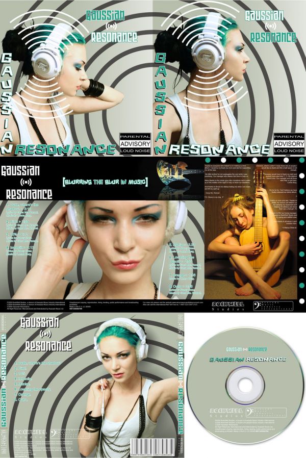
Now here is the end result shown in one image. The CD cover here is not in right proportion in term to the other covers.
But this image is just to show the whole result of this tutorial( which I believe is generally me yapping away endlessly).
Also if there are any mistake( since this is really a long tutorial) or any suggestion or query. Please feel to comment.
Hope you enjoyed me talking endlessly lol. xD
