Quick Tips for Making Perfect Logos

Logo designing can be considered the most profitable niche of graphic design. There are countless websites offering logo contests and one can earn up to 200 Dollars for a routine logo.
Designing a logo might seem like an easy job… and it can actually be that way, only if you do it wisely.
This is a quick tips article and it will only take a few minutes to read it thoroughly, so please don’t skim.
The Base Concept

Image courtesy: GenevaLunch
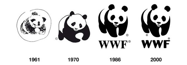
When someone says he has an IBM computer, immediately, IBM logo flashes in your mind. A logo is the face of the company. It should portray the company’s characteristics, and for that a logo must contain good concept. Remember WWF (World Wildlife Fund) logo… great concept.
One of finest designers of our time is Paul Rand. He always designed with concept and that’s why he became so successful. What I’m writing today are some of the tips I extracted by observing his work.
Things to Remember

Image courtesy: James Clarke Sturges
Simplicity Works
Keeping it simple always works. Take Apple or Nike logo for example, everyone remembers them because they are very easy to remember. Detailed artwork on a logo can be counter-productive.
Color Choice
All colors have their own characteristics, choose them wisely. To know more about colors and their trait, visitPsychology of Colors.
Use Web Safe Colors
You wouldn’t want your logo to lose its appeal when it comes on web.
Black and White
It is important that your logo should not lose its design if it is printed in grayscale. If the logo you designed doesn’t look good on photo copied or faxed documents, it’s not your best work.
Keep it Vector
Gradients and other mid-tone graphics look good on computer screens but they are not always useful. Keep it in solid color vectors.
Aspect Ratio
Always remember that a logo can be used on various items, such as billboards, letterheads and websites. So it needs to have an adaptive aspect ratio. 1 x 1 square works out perfect in all the cases.
Text
Keep the artwork and text completely separate, so that the logo can be used independently.


